Born Ruffians, are a Canadian indie rock band formed in 2004, originally from Midland, Ontario, located near Georgian Bay. They are currently signed to Warp Records. The members are Luke LaLonde (guitar/vocals), Mitch Derosier (bass) and Steven Hamelin (drums), recently they have recruited Andy Lloyd (guitar/keyboard) to fill in for live shows.
The band moved from Midland to Toronto in 2004. After some local performances and a growing online reputation, the band was signed to the UK electronic music label Warp Records. They released their self-titled debut EP in 2006. It was recorded by Ryan Mills at Little King Studio (now Sleepytown Sound). They have received extensive airplay on CBC Radio 3 with their debut single, "This Sentence Will Ruin/Save Your Life," as well as a cover of Grizzly Bear's single "Knife" which the band recorded live on KEXP. In 2007, they released the single "Hummingbird," which was included on their first album Red, Yellow & Blue.
They have toured with Franz Ferdinand, Caribou, Peter Bjorn and John, Hot Chip, The Hidden Cameras, Tokyo Police Club and The Honorary Title. They toured Canada (mostly Ontario) throughout April 2008, completing the North American leg of their tour on April 26, 2008, with an album release party at Lee's Palace in Toronto. In May and June 2008, they finished their UK tour and continued touring throughout Europe.
They appeared in the British teen drama Skins, playing "Hummingbird" in a Brooklyn night club. The song is also featured in a television advert in the UK for Orange mobile telecommunications' "Animal" campaign. "Hummingbird" is also featured in a car advertisement in Australia
They have recently released an album What to say and below is the video for the album title song;
Tuesday 23 November 2010
Tuesday 9 November 2010
Monday 8 November 2010
Initial Plans
For the initial plans we have to make decisions about;
- The price of our magazine
- The frequency of publication e.g. weekly, monthly, every two weeks
- Average issue size
- Regular content
- Feature articles
For my magazine I chose to price is inbetween: £2.95 - £3.50
This is because i am choosing to issue my magazine monthly rather than weekly because the issue size will be 110-125 pages per issue.
The regular content will consist of:
- Monthly album chart
- Most downloaded
- Best new live band of the month
- Gig Guide
The feature articles for my magazine;
- Kings of Leon on Tour
- Gorrilaz let loose in the studio
- Born Ruffians interview
Article Research - Born Ruffians interview
Questions for my interview with the Born Ruffians;
1. What is your favourite aspect of touring?
1. What is your favourite aspect of touring?
2. Who are your inspirations?
3. When did you first start playingtogether
4. If you could choose one band to play with who would it be?
5. How did you come up with the name Born Ruffians
6. Whats the worst thing about touring?
7. Where was your favourite show you've played?
8. Who is your favourite band currently?
9. Will you be planning on wrighting a new album?
10. What are you planning to do after your current tour?
Below are hyperlinks to the bands website and myspace page.
Thursday 4 November 2010
Planning Production
Front cover image - I am planning to use a live shot of Born Ruffians at the 02 Academy in Liverpool, i will use a low angle mid shot of the band whilst playing.
Coverlines for front cover;
I will be using an image of the leeds festival 2010 programme, and band merchandise eg. t-shirts

Coverlines for front cover;
- Efterklang exclusive
- Two Door Cinema Club take us back stage
- Interview with Born Ruffians (My double page spread)
- New Music Sit-com
- Leeds and Reading review
- Up close and personal with Darwin Deez
- Latest Band merchandise
- The Drums take over the studio
I will be using an image of the leeds festival 2010 programme, and band merchandise eg. t-shirts
Article:
For my double page spread article i will be conducting an interview with Born Ruffians who are a canadian band on a UK tour. I will be using an image of the band to cover one of the two pages and the answers from my interview and a biography of the band.


Tuesday 2 November 2010
Publication Plan
Title: Rhythm
Positioning Statement: Love Indie, Love Rhythm
· Feedback
· Rhythm news
· Quiz
· Album reviews
· Poster
· Competition
· Live reviews
. Competition
. Gig guide
. New releases
Feature Content:
· Born Ruffians interview
· Two door cinema Club
· Gorrilaz
· The Kings Of Leon
· Fools Out
· Rising of the Phoenix
· XX marks the spot
Positioning Statement: Love Indie, Love Rhythm
Price: £3.50
Distribution: Newsagents, Supermarkets, Music Retailers, Concerts and Gigs.
Distribution: Newsagents, Supermarkets, Music Retailers, Concerts and Gigs.
Rationale: The approach of the magazine is to provide the audience with a unique insight to all the latest bands and gigs. It will also allow fans to discover the secrets of their favourite bands and provide information for those upcoming and ‘wanna be’ bands.
Style: It will be written in a way which relates to my target audience and the likely readers of the music magazine. The magazine will be written informally and use humour and lexis in a way the audience will relate to, therefore providing them with the unique view point of their favourite artists.
Regular Content:
· Feedback
· Rhythm news
· Quiz
· Album reviews
· Poster
· Competition
· Live reviews
. Competition
. Gig guide
. New releases
Feature Content:
· Born Ruffians interview
· Two door cinema Club
· Gorrilaz
· The Kings Of Leon
· Fools Out
· Rising of the Phoenix
· XX marks the spot
House Style:
Cover lines:Headlines:
Standfirst:
Captions: Franklin Gothic Demi 14 pt
Features first paragraph: Franklin Gothic Demi , 5 lines deep, first two words in capitals
News first paragraph: First two words in bold capitals.
Body Text: Times New Roman 11pt
Colour Scheme: Red, White, Black
Features first paragraph: Franklin Gothic Demi , 5 lines deep, first two words in capitals
News first paragraph: First two words in bold capitals.
Body Text: Times New Roman 11pt
Colour Scheme: Red, White, Black
Sunday 31 October 2010
Results of my Questionnaire
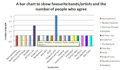
1.What is your favourite band or artist?
 What three words do you associate with the music genre?


What three words do you associate with the music genre?What colour would you suggest for a colour scheme of a indie music magazine?
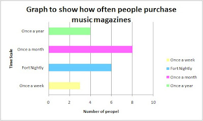
How often do you buy music magazines?
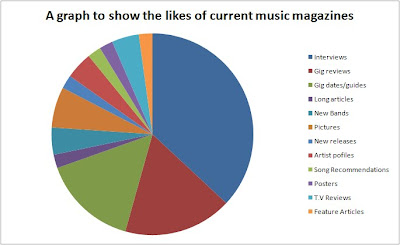
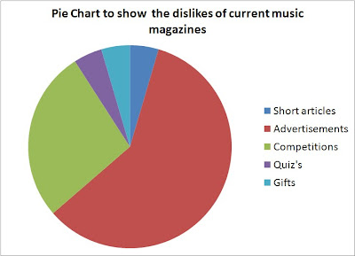
What do you like and dislike about the music magazines you currently read?
How much are you willing to pay for a music magazine?

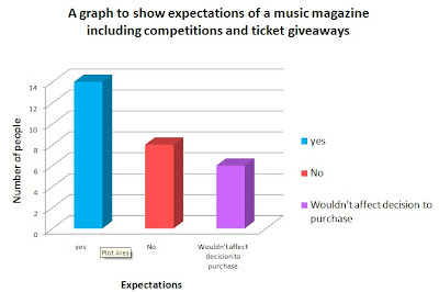
 Would you expect competitions and ticket giveaways in a music magazine?
a)£1.50 - 0
b)£2.00 - 1
c)£2.50 - 6
d)£3.00 - 5
e)£3.50 - 7
f)£4.00 - 2
What do you most enjoy in a music magazine?
What do you most enjoy in a music magazine?
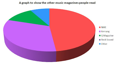
What other music magazines do you read?
Would you expect competitions and ticket giveaways in a music magazine?My Music Magazine Questionnaire
Music Magazine Questionnaire
1. What is your favourite band or artist?
.......................................................................................................................................
2. What three words do you associate with the music genre indie?
.......................................................................................................................................
3. What colour would you suggest for a colour scheme of a indie music magazine?
.......................................................................................................................................
4. How often do you buy music magazines?
Please circle your answer.
a) Once a week b) fort nightly c) Once a month d) Once a year
5. What do you like and dislike about the music magazines you currently read?
Please fill in the table below.
Likes
Dislikes
6. How much are you willing to pay for a music magazine?
Please circle your answer
a)£1.50 b) £2.00 c) £2.50 d) £3.00 e) £3.50 f) £4.00
What do you most enjoy in a music magazine?
.......................................................................................................................................
…………………………………………………………………………………………………..
What other music magazines do you read?
a) NME b) Kerrang! c) Q magazine d) Rock Sound e) Other
If other please state below
.......................................................................................................................................
Would you expect competitions and ticket giveaways in a music magazine?
a) Yes b) No c) Wouldn’t affect decision to purchase
Mark in order of importance the following. Insert numbers 1 - 7
(With 1 being the most important and 7 being the least)
- Competitions
- Gig guides
- In-depth interviews
- Free demo CD’s
- Artist profiles
- Advertisements
- New music technology
Saturday 16 October 2010
Magazine Research
Title : NME
Cover Price : £2.20
Genre : Indie/AlternativeIssue
Frequency : Weekly
Issue Size : 70
Editor: Krissi Murison
In 2000 Steve Sutherland left to become Brand Director of the NME, replaced as editor by 26-year-old Melody Maker writer Ben Knowles. The same year saw the closure of the Melody Maker (which officially merged with the NME) and many speculated the NME would be next as the weekly music magazine market was shrinking.  Title : Q
Title : QCover Price : £3.99
Publisher : Bauer
Genre : Indie/Alternative Issue
Frequency : Monthly
Issue size : 115-132
Editor: Paul ReesThe magazine features: new releases , reissues , music compilations, film and live concert reviews, as well as radio and television reviews. It uses a star rating system from one to five stars; indeed, the rating an album receives in Q is often added to print and television advertising for the album in the UK and Ireland. It also compiles a list of approximately eight albums, which it classes as the best new releases of the last three months.

Friday 15 October 2010
Codes and Conventions of a professional double page spread (Kerrang)
Below are the codes and conventions of a professional music magazine (kerrang), it identifys the common features used in a music magazine to make it a successful product.
- Heading is positioned at the top of the page and is commonly placed across both pages.
- Strap line is often found at the top of the page.
- Drop cap is used at the beginning of the text.
- The text is in a small font size.
- Drop quote is a quote in the middle of the article taken from the article itself. Large font
- By line is who it is written by usually includes the photographer too
- Main image is usually the background, left or right side, and is linked to the text
- Name of magazine can be found in the bottom corner along with page number
- Stand first is a summary of the article, is in a larger font and on a darker background, at the top of the page
- The text is in columns
- The double page spread is usually the feature article
Tuesday 12 October 2010
Evaluation of School Magazine
In what ways does your media product use, develop or challenge forms and conventions of real media products?
I believe that my school magazine follows the codes and conventions of a successful school magazine in a way that is effective. While producing my front cover i followed the codes and conventions very strictly, and did not deviate from them in any way. This is also the same for my contents page however i did use a larger font size for the text included on the page. This i will consider when producing my music magazine. Also when producing my contents page i did not have my double page spread image much larger than the other inserts included on the page.
The central image i used for my school magazine shows the student looking directly at the reader, this technique is called direct mode of address, it is used to make the reader feel that the character is trying to influence the reader to buy the product. This technique i will consider using again when producing my music magazine.
How did you use new media technologies in the construction of your media product?
To create my front cover i used adobe photoshop, although the software is hard to navigate it produces the best final product for the task needed to be completed. This is because it has a wider range of colour schemes, text styles and it also has photo editing software. This is why quarke express would not be suitable when producing a front cover.
However Quark express is perfect when designing a contents page, because it allows you to set the layout in to columns which is part of the codes and conventions when creating a contents page. Therefore i will be using quark express to produce my contents page and double page spread of my music magazine because it allows you to set the text in a way that is sufficient.
What are the strength and weaknesses of both the product and your use of new media technologies?
I believe my front cover contains a few strengths as it includes a good central image, which accomadates what the briefing states, that it should be a medium close up of a student. I am also happy with my central image as i used adobe photoshop to produce the final image including two seperate images.
However my front cover does not include a sufficient number of tag lines, and that the colour of the text makes it hard to read. I am also dissappointed with the positioning statement which i have used 'Your way to get an A' this is because it suggests it is all about school work, although the product i wanted to produce was also about other non education based subjects such as Ice radio.
The software i used to produce both my contents page and front cover i was very inexperienced on them and was not familar with all the tools. So therefore my product may have aspects which are not great but this would be due to the lake of experience of the softwares (adobe photoshop and quark express).
Contents Page final product

Here is the final product of my contents page, i designed this contents page using quark express, which allows me to create a professional layout for the page as it establishes clear colums for text and images.
My contents page follows teh brief as includes 10 feature atricles under the titles, features, news and exclusive.
It also refers to the codes and conventions of a successful magazine, by;
- images advertising the storys
- contains small text
- divided into colums
- pages numbers before the title of the story
Front cover final product

Above is the final design of my front cover of my school magazine, i used adobe photoshop to complete my front cover. The front cover includes;
- A mast head
- Central Image
- Tag Lines
- Buzz word (Plus)
- Positioning Statement ('Your way to get an A')
- Date
- Issue Number
- Price
- A colour scheme (the colour of the text follows the colours of the Weatherhead school)
All of these aspects are part of the codes and conventions of a successful magazine.
Images i will be using for front cover and contents page of my school magazine
 Here is a low angle mid shot of a sixth form student, which i will be using as one of the inserts on my contents page.
 This a shot of the new school uniform this too will be used as an insert on my contents page to refer to the story on the new school uniform.
This image will be used as my main/central image, as the brief for the preliminary task informed us to use a student in medium close up as the main image.

This image will be used as the background of my central image as the cover story of my magazine is 'Ice radio is back!'. I will use adobe photoshop to produce the final image for my contents page.

This image i will be using as an insert on my contents page to reference the story on the double page spread of my music magazine.
 Like the previous picture this image will be used on my contents page to relate to the tag line i will be using on my frnt cover 'Build up to the big match'.
Sketch for contents page (school magazine)

The image above is a sketch i drew of my plan for the contents page of my school magazine, it includes a title ' A- Way this week', it also will include inserts (pictures) representing the contents of the magazine. The list of contents will be located on the right of the page in a column structure with reference to page numbers of individual stories.
The contents page had to include at least 10 feature articles which would appear in the magazine.
Sketch of front cover (preliminary task, School Magazine)

Above is a picture of the sketch i developed to plan the layout, mast head, tag lines, and also the main/central image.
I will be able to use this sketch to help produce my final front cover for my school magazine. The sketch includes the mast head i will be using for my final design which is 'A- Way', i chose this as it relates to school and it is clear that it does.
This design had to follow the codes and conventions of magazine. Below are what i used for each code and convention;
Mast head - A- Way
Slogan - Your way to get an A
Tag lines - Your weekly eaxm revision tip
Main Image - Student in radio studio
Camera angle practice
We were set a task to produce images for the different camera angles we had been studying.
Below are the photographs which i produced to complete this task;
Below are the photographs which i produced to complete this task;
A low angle medium close up

A high angle long shot

An extreme close up of time

A close up of someone using a mobile phone

A close up of someone in nature

A two shot in medium longshot

An over the shoulder shot of someone writing

A very longshot conveying isolation

A medium close up

A long shot

A Shot showing stress

Monday 27 September 2010
Camera Work
In are lesson on the 24th of september, we looked at the various camera angles and tried to take various photos to put what we learnt in to practice. The camera angles we looked at were;
- Close up
- Medium close up
- Two Shot
- Big Close up
- Over the shoulder shot
- Low angle
- Mid Shot
- Long shot
- Close up
- Medium close up
- Two Shot
- Big Close up
- Over the shoulder shot
- Low angle
- Mid Shot
- Long shot
Wednesday 22 September 2010
Codes and conventions of music magazine contents page
We have also covered the codes and conventions of a contents page in the same lesson on the 22nd of September. Below are the codes and conventions of a music magazines contents page;
- Images advertise the story within the magazine, they usually have small captions containing a short description of the story.
- The contents page is commonly divided in to columns.
- There is limited text, what text there is a small size this is to fit all the text in, and this means the images are more eye catching to keep the reader interested.
- The page number is with the illustration.
- The page numbers are usually before the title of the story.
- Usually one large image, this large image is the double page spread.
- Storys are not listed in chronological order.
Codes and conventions of music magazine front cover
Today in lesson we studied the codes and conventions of magazine front covers, below i have listed the codes and conventions i identified;
- Most magazines have the issue number on the front cover, this shows the market how developed the magazine is.
- the front cover also includes the price of the magazine, the price reflects the content and production value of the magazine.
- The barcode also appears on the front cover, this shows that it is a official product.
- The main image is positioned in the centre of the page, and if it is looking directly at the reader it is called direct mode of address, this reflects the attitude of the magazine. The central/main image can be male or female.
- Other inserted images show the reader the content of the magazine and illustrates the cover lines.
- Cover lines are text which advertise whats in the magazine.
- Music magazines may include promotions such as free cd's, and use buzzwords (plus and exclusive).
- The typography of the masthead has to relate to the genre, it also has to be bold, eye catching and is the brand name. All of which must be unique.
- Some front covers may include small print at the bottom to promote who created the magazine.
- The colour of the magazine has to reflect the genre.
Subscribe to:
Posts (Atom)